Informing Design’s home base has served as a laboratory for much of the firm’s work.
Book Publishing
Traffic Sign Systems
Transit Mapping
Bike Mapping
Marathon Mapping
Event Mapping
Shopping District Mapping
Interpretive Panels
Book Publishing
The firm’s focus on city de-complexifying maps and signs began with its blockbuster first book.
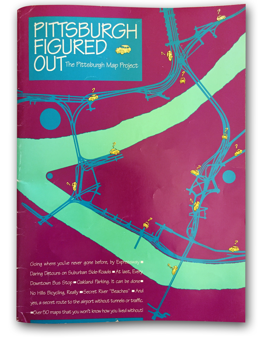
Pittsburgh Figured Out atlas, Two Editions
Client: Published by Informing Design
Time Frame: 1990-1991, sold out

Finding Yourself in Pittsburgh atlas
The firm’s first map book prepared entirely within graphics software. Maps were organized as a kind of animation, scanning the region from West to East, and then North to South, zooming in and out as needed. The firm’s remapping of the interstate highway system as a polar coordinate system centered on New York City first appeared in this book.
Client: Published by Informing Design
Time Frame: 1995, sold out

Pittsburgh Traffic Cheat Sheets atlas
Organized similar to the above book, it featured dozens of hints as to how to beat traffic and find good parking places.
Client: Published by Informing Design
Time Frame: 2010, sold out
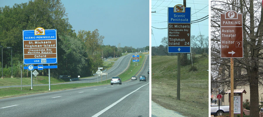
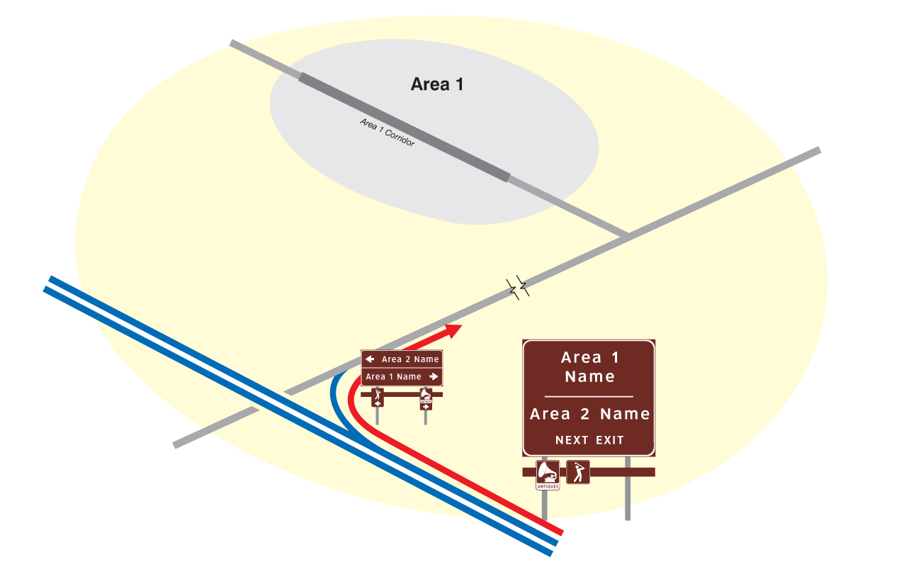
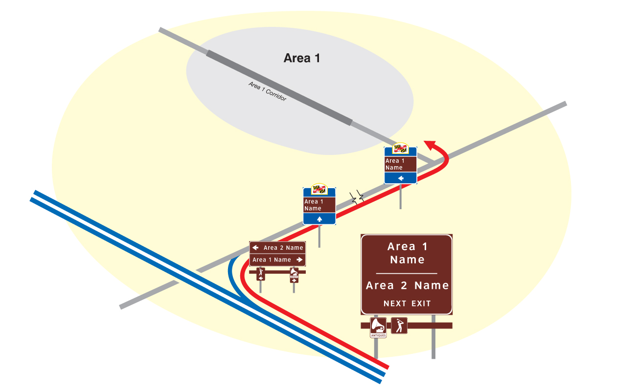
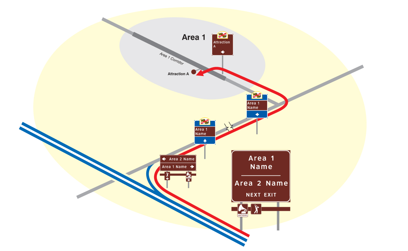
TRAFFIC SIGN SYSTEMS
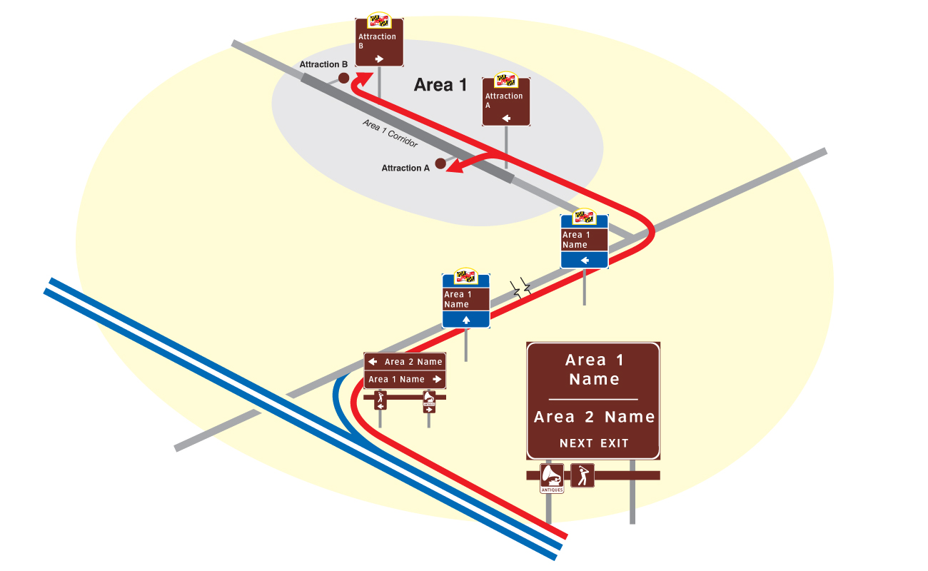
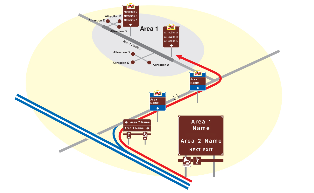
The firm’s signature de-complexifying mapping tool was first developed to conquer the City with a new comprehensive traffic sign system.

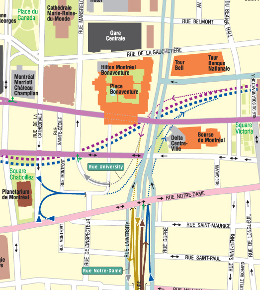
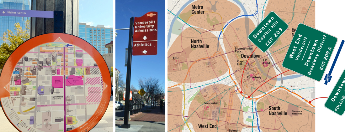
Pittsburgh Wayfinder System
The traffic sign system encompasses the entire City with over 1,000 signs, making it one of the country’s largest such systems. (See “Gridding the Ungriddable.”)
Client: City of Pittsburgh
Time Frame: Designed and Installed, 1995 – 1997; currently in use and kept up-to-date
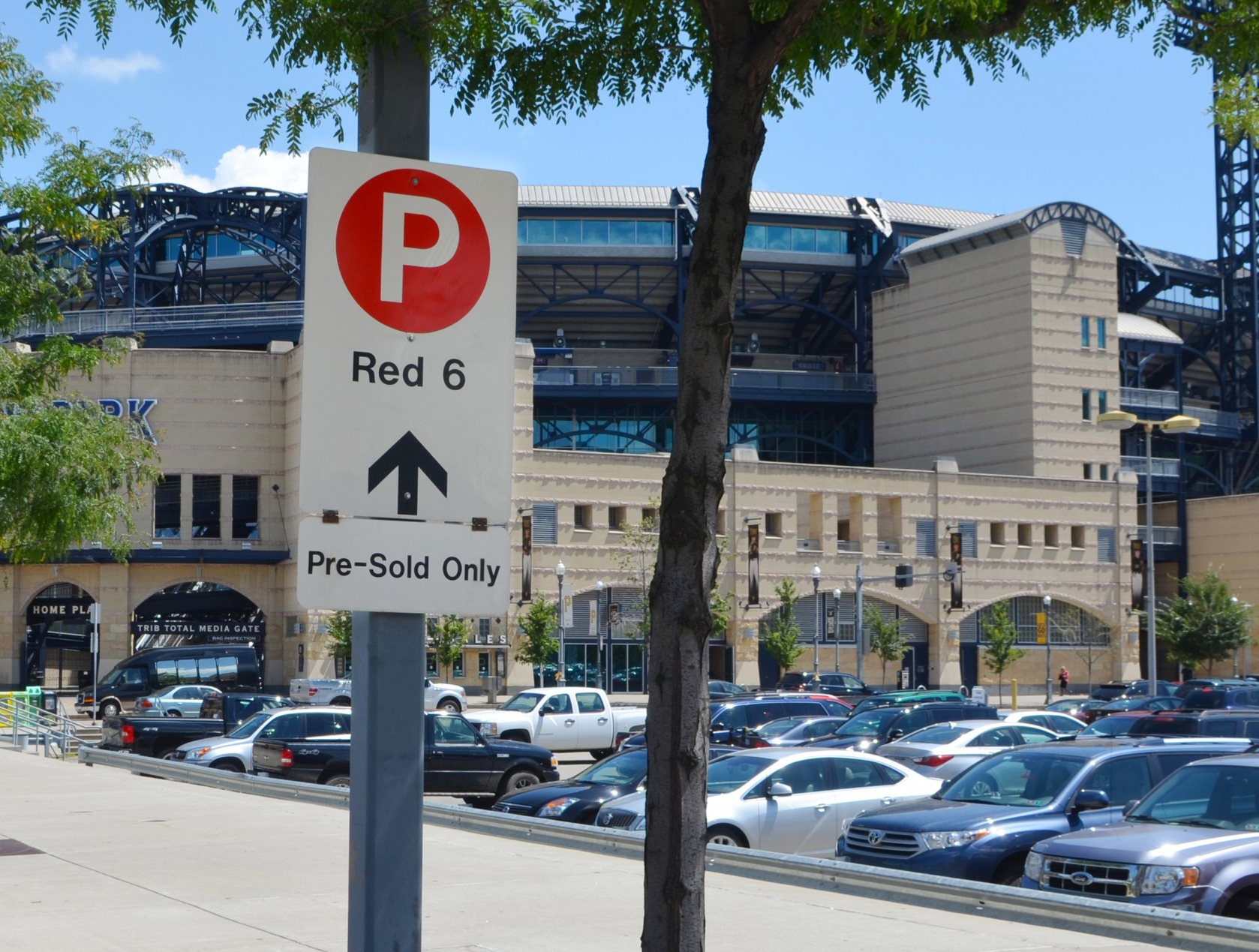
Heinz Field Event Parking Sign System and Map
The firm was tasked with developing a parking sign system for the parking lots serving the then brand new Heinz Field, home to the Pittsburgh Steelers. The solution involved big color-coded dots that organized the lots by access sequences.
Client: City of Pittsburgh
Time Frame: 2001, currently in use
TRANSIT MAPPING
Transit mapping and schedule design has been a primary research interest of the firm from the beginning.

Map Stop and Map-to-Go
An experimental program to place map kiosks at dozens of locations in Downtown and Oakland, and stuffed with quarterly “Map-to-Go” newspapers. A new kind of time schedule chart was developed that enabled a quick read of bus arrival times for up to two dozen routes at a give stop.
Client: Mellon Bank
Time Frame: 1997

Pittsburgh Area Transit System Maps
This was the firm’s first effort to simplify an extremely complex system of bus and light rail routes.
Client: Port Authority of Allegheny County
Time Frame: Three editions, 1999 – 2002
Downtown Bus Shelter Spider Maps
The firm went on to develop transit “spider maps” with its 3-D maps of Downtown in the center, and with simple route info radiating out in a band of blue circling the map.
Client: Downtown Partnership
First Generation: Deployed Downtown 2003
Second Generation: Deployed Downtown 2013

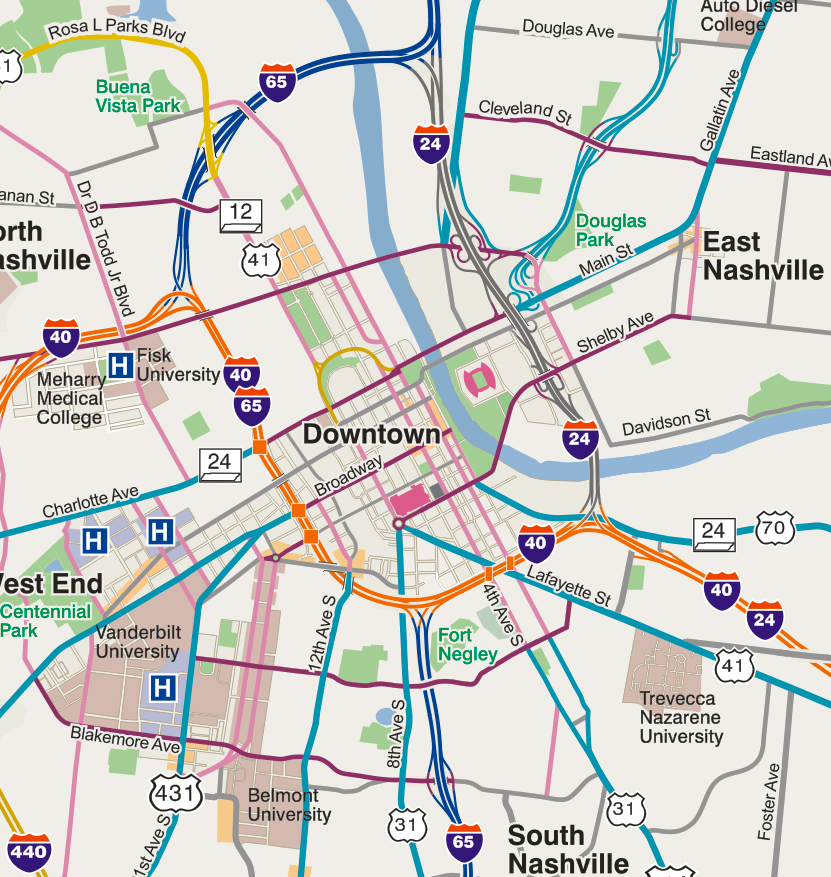
De-complexified System Map
The firm’s latest generation of system map provides London Underground level of simplicity without needing to violate geographic scale. (See “Disagreeing with the London Underground Map”)
Client: Informing Design research
Time Frame: “Bus-tronic App” to premiere in 2016
BIKE MAPPING
The firm applied its de-complexifying tool to bike route mapping in Pittsburgh in 2008. See “Urban Bike Maps, sans spaghetti.”
Bikeable Pittsburgh Figured Out, Multiple Editions
Available later this year on an app.
Client: Informing Design research
Time Frame: 2010 to present
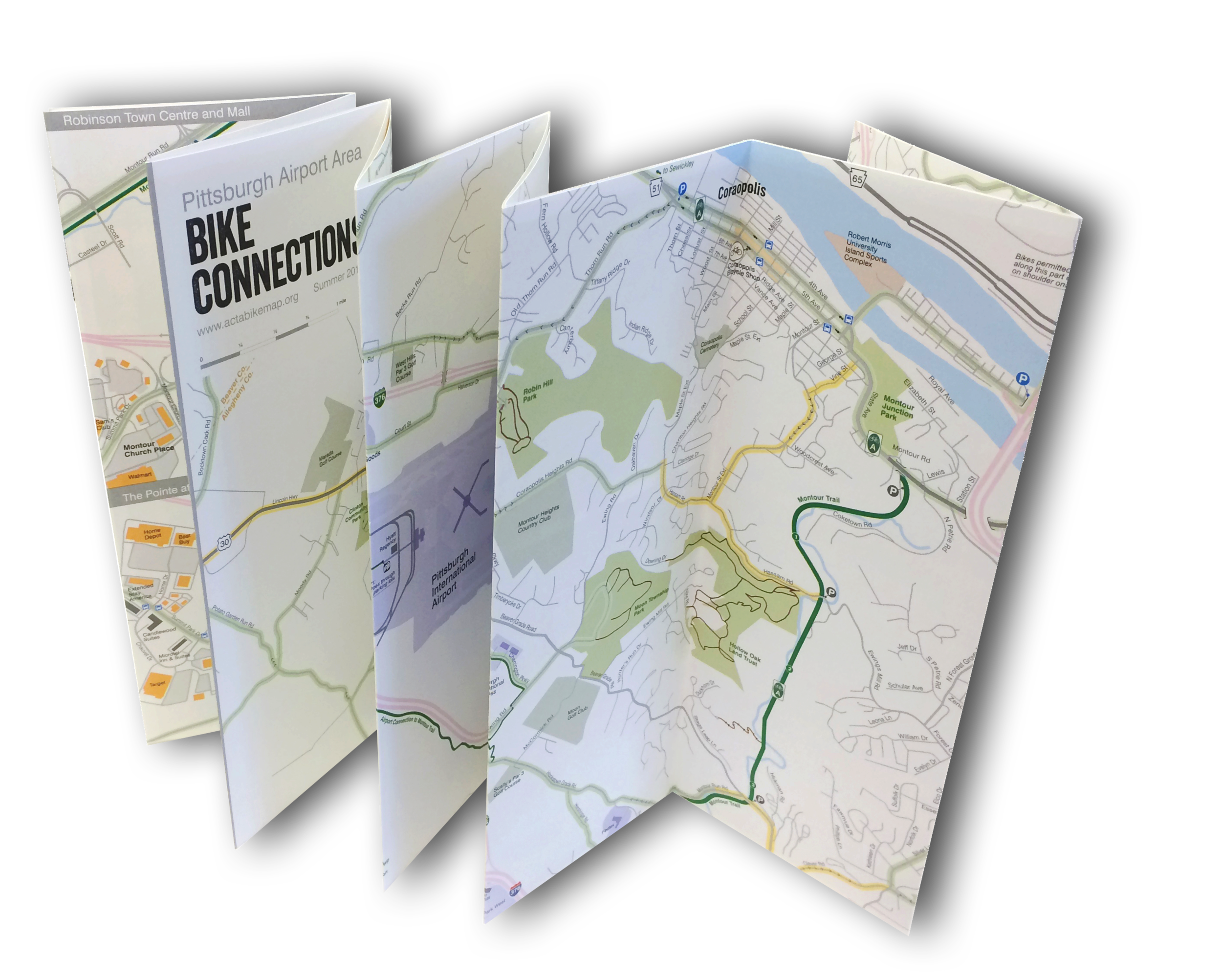
ACTA Bike Map App, Double-Mashup Web Site, and Print Map
The firm designed a bike map for the region around the Pittsburgh International Airport in multiple zooms. Routings were organized as “tributaries” leading in and out of the main “river” of the Montour Trail. Look up “ACTA Bike Map” on the iOS app store or Google’s Play store; or go to actabikemap.org.
Client: Airport Corridor Transportation Association
Time Frame: 2014, currently in use
MARATHON MAPPING
On its own, the firm discovered and mapped a “secret” escape route from the center of the City on marathon Sunday and distributed it on-line. This led to the firm becoming the de facto cartographer to the Marathon in subsequent years.
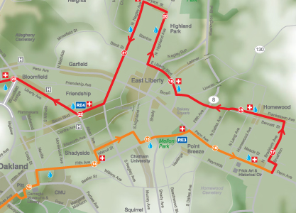
Pittsburgh Marathon Mapping,
in Print, PDF Downloads and as Double-Mashup Web Site
The firm produces dozens of maps ranging from course maps with elevations to administrative maps and maps for the State Police helicopter unit.
Client: Pittsburgh Three Rivers Marathon, Inc.
Time Frame: 2011 - Present
Event Mapping
Twenty years ago, the firm invented what it called the “Orange Peel Perspective” to solve the central cartographic problem of “you are here” maps: how to unambiguously connect your immediate surroundings to the pathways to far off destinations. It’s best application turned out to be for big events with access and/or egress issues. See “The Orange Peel Perspective.”
CMU Graduation Routing Map
To deal with a construction-impacted graduation site, the firm used its “orange peel perspective” to map the stadium, the surrounding campus and off-campus sites so that egress pathways would be easy to understand for visitors from Arabic and far eastern countries.
Client: Carnegie Mellon University, Office of University Events
ime Frame: 2015
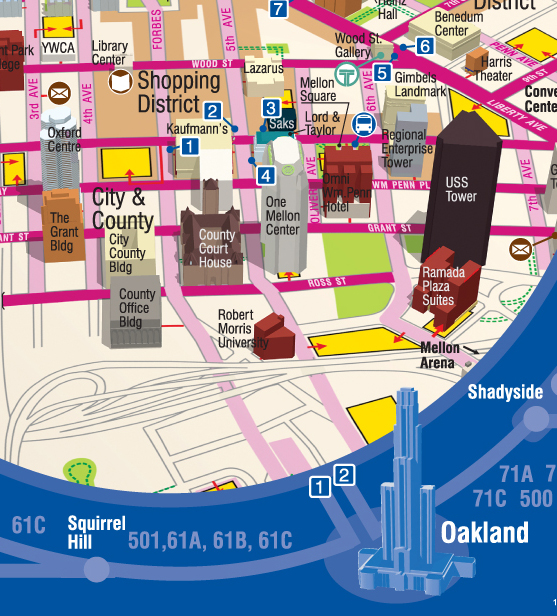
Shopping District Mapping
Informing Design once mapped every retail establishment in Pittsburgh and its suburbs. First deployed in experimental shopping atlases in the late 90s.

The Strip Map, Four Editions
The firm designed a map pamphlet for the historic open-air market district of Pittsburgh that is also one of the area’s most popular night spots with dance clubs and restaurants. The pamphlet has been called “Pittsburgh’s most requested map” by the CVB. It features building by building detail on one side, and then an overview map of Greater Downtown on the other.
Client: Neighbors in the Strip (the local BID)
Time Frame: 2003 - 2012
Interpretive Panels
In addition to cartographic expertise, the firm also has illustration expertise in-house with an award-winning artist on its staff.
Grandview Promenade Interpretive Panels
Research, art and text were developed for a series of 12 interpretive panels installed along Pittsburgh’s number one tourist attraction: the Grandview Promenade on Mt. Washington with the region’s fanciest restaurants and dramatic views of Downtown, reached by iconic inclines. Included were an original water-color rendering of the view of Downtown and an illustration of the Underground Railroad stop at Bigham Manor House.
Client: Mt. Washington Development Corporation
Time Frame: 2013
History Center Displays
For the Senator John Heinz History Center, the firm prepared two large wall panel displays on the theme “What Makes Pittsburgh Pittsburgh.” One illustrated Pittsburgh’s position geographically in the context of the nation (and the Lincoln Highway elevation map from the 30s) and in the context of Pennsylvania. The other panel zeroed in on the City itself with a topographical map with elevation contours and a series of illustrations featuring major neighborhood highlights.
Client: Senator John Heinz History Center
Time Frame: 2000