
Gridding the Ungriddable:
what it took to figure out Pittsburgh
Twenty-five years ago, Bob Firth authored the Pittsburgh Figured Out atlas that quickly turned into a regional publishing sensation. The book climbed into the top ten best sellers list nationally at the then-massive Waldenbooks chain, even though it was only for sale at a couple dozen of the roughly 1,200 Waldenbooks locations. News of the book was featured in the LA Times and dozens of other publications.
Bob had struck a chord.
Pittsburgh had been infamous for a century for its complicated street network. The famed WWII journalist Ernie Pyle once said that it was as though the city had been laid out by a mountain goat. With three rivers and hundreds of hollows and hills, the City actually has more bridges (over 400 in total) than Venice, Italy.
When the City finished a new expressway and bridge going north near the end of the 1980s, it completed a pentagon of expressways around Downtown and unintentionally created a perfect storm of confusion. Ramps that appeared to be going straight ended up taking you to the right. Other ramps would connect in one direction but not in the other. The huge new bridge that crossed the Allegheny to the North Side could not actually be used to access the North Side, and the signage in the other direction ignored the existence of Downtown, the primary destination of the new billion-dollar highway. People were going nuts: how could we be getting lost on an eight-lane highway with Downtown right in front of us, plain as day?
No; in Pittsburgh, even if you can see it, it doesn’t mean you can get there from where you are, especially not by taking what seems to be the obvious route.
Bob’s atlas began with a careful lane by lane rendering of this pentagon of expressways and associated ramps, colored in to show how everything flowed, or didn’t. This one map alone was a pre-internet viral hit. It was followed by dozens more maps depicting the weirdnesses of getting in and around every section of the City and the suburbs.
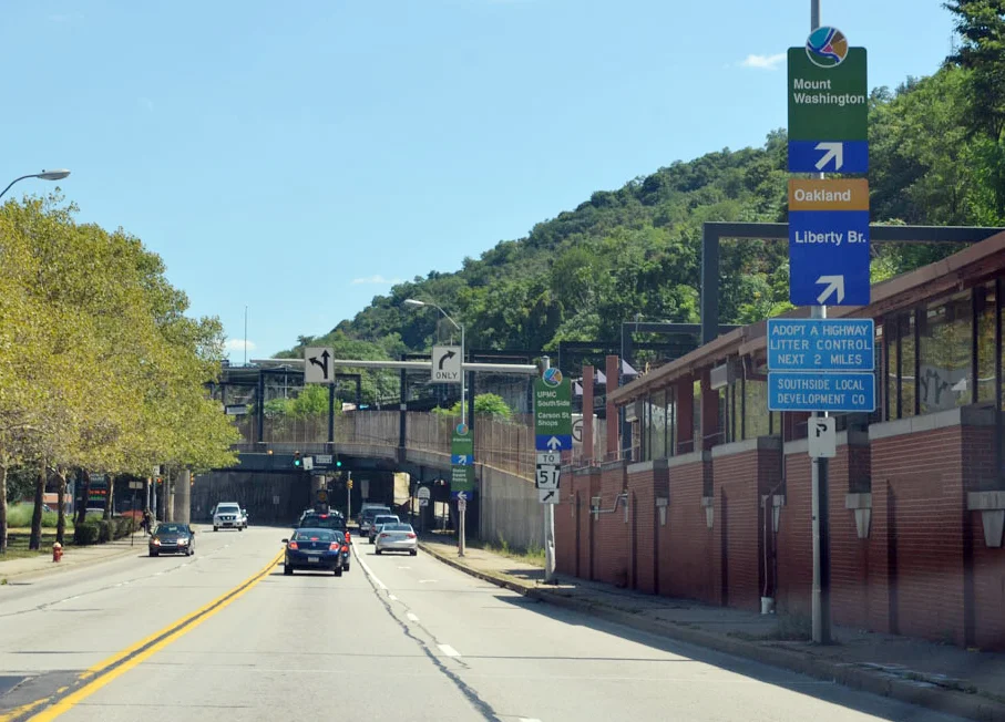
But Bob wasn’t satisfied. He had a theory that all this weirdness in how to get around Pittsburgh could be explained in a single map graphic. Five years later he had his eureka moment, while he and his firm were working up the city’s Wayfinder Sign System (which, with over 1,000 signs, is one of the largest such systems in the Country).

The key was to be found in the idea of “aggregate effect mapping.” Admittedly, this is a fancy way to talk about creating a cohesive route that connects one place to another, such as the numbered U.S. highways like the east coast’s Route 1 or the Lincoln Highway’s Route 30. When they were invented a hundred years ago, these routes aggregated a bunch of road segments under the banner of single number to achieve the effect of reaching the desired destination with the simplest possible instruction — follow the route number. Before route numbering, motorists would get lost in a hopeless tangle of local roads — AAA went so far as to create picture books full of what the intersections actually looked like where drivers would need to make turns as they traveled from one city to another.
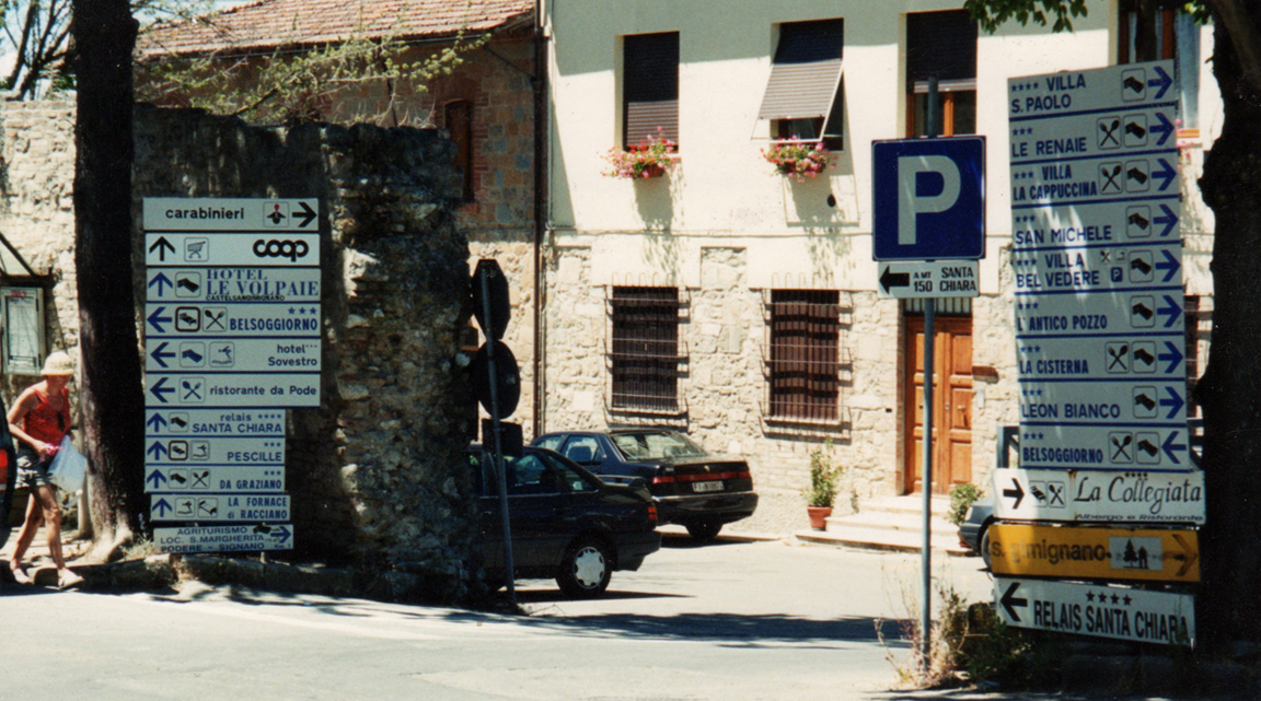
Route numbers, though, were implemented over relatively long distances. They were never designed to prevent someone from getting confused while driving around within cities. But then again, imagine trying to create an in-City route system to cater to every conceivable origin and destination: it would become a hopelessly tangled mess that no one could follow. Coming up to an intersection with such routings in place would be like coming up to one of those intersections in Italy with signs pointing to 20 or 30 different places . . . hopeless.
Ahhh . . . we have come to the insight of the eureka moment. It turns out that there is a way to map out hundreds of local routes without letting them get tangled up, which is a pretty unexpected result.
How is it possible?
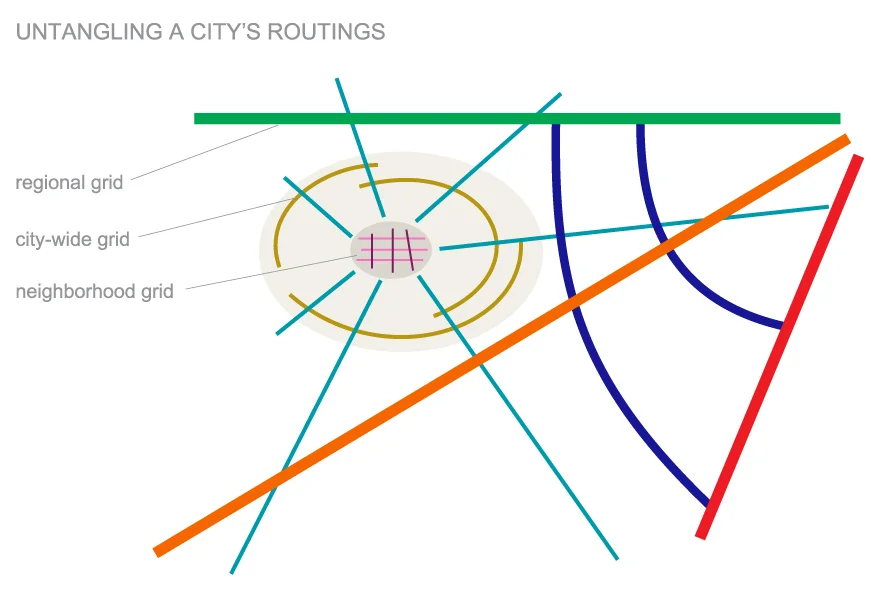
Picture that Italian intersection with three distinct types of signs: two that point to places far away (regionally), two that point to intermediate destinations (neighboring districts), and two that point to very local destinations (within the district you’re in). Now that intersection will be relatively easy to traverse, because your travel intentions will naturally relate to just one pair of signs. The trick is being able to repeat that series of simple directions across hundreds of decision points without the traveler ever being left scratching his or her head.
Here’s how it can be done: by ignoring road segments that get you tangled up, you can always highlight just a particular set of routings that span a given area so that they comprise a simple grid. That process can then be reiterated over successively smaller areas in such a way that the result is distinct layers of routings that don’t tangle with each other, ever! This overall “aggregate effect” mapping makes clear the natural landscape of big areas to head for, then the medium ones within big ones, and finally the smaller ones. A complicated topography, like Pittsburgh’s, is exposed as not being that complicated after all, as one area can “naturally” lead to another when the routings have all been untangled. Maps of even this crazy a city can be de-complexified!
Here’s an example of how it works for Pittsburgh’s complicated South Side Slopes.
These slopes consist of a spider web of switchbacks up and over the hill on the south bank of the Monongahela River, across from Downtown. To someone new to the area, it can be pretty scary trying to find your way around. There is one particularly perverse intersection at the top of the hill, where Wyoming St meets Virginia Ave. There are two options before you at this point: you can take the road that is heading steeply down or you can take the road that remains level. Which do you take to stay on top of the hill? Of course, you take the road that is heading steeply down. Just out of sight from you, it immediately rises back up to keep you on the hilltop. On the Slopes especially, no routing is obvious!
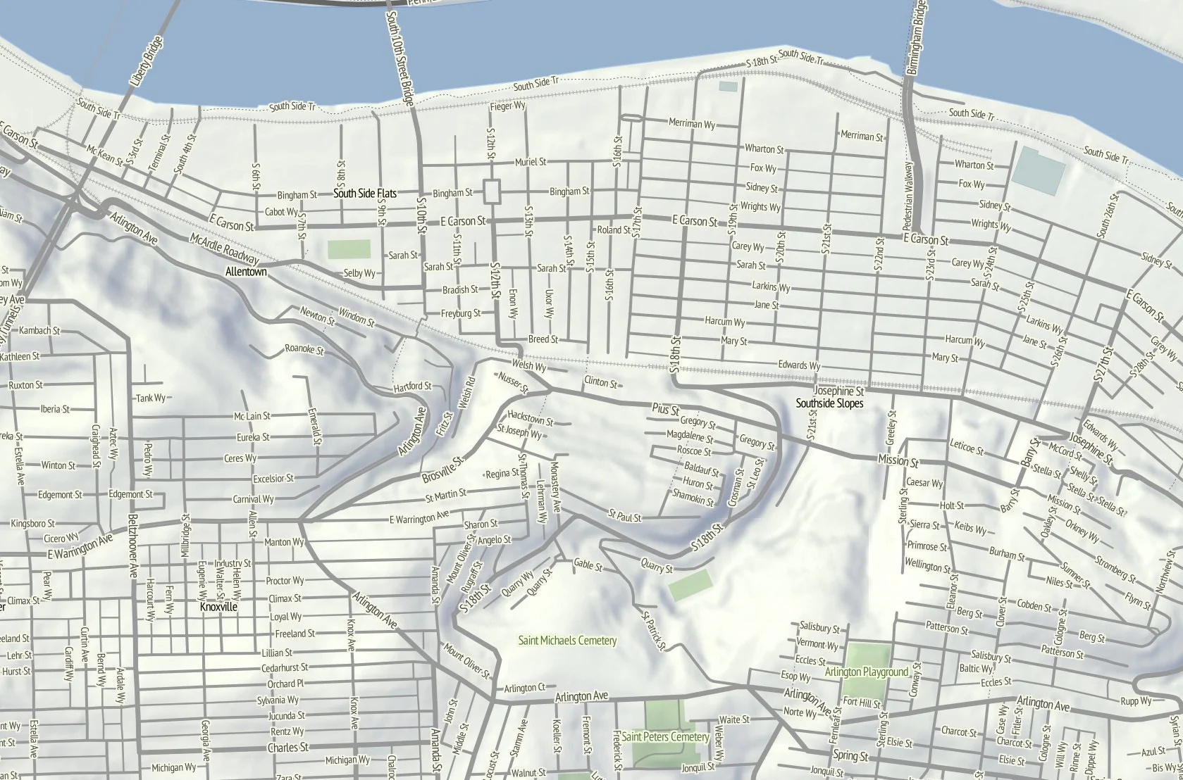
How does our solution work here? Well, the Slopes do exhibit a simple structure, when viewed with “aggregate effect” glasses. On one side of the hill there is a main riverside road, on the other side of the hill is a main valley road, and on top of the hill there is a sequence of roads that follows the ridge top. We can map those in purple as our set of east-west grid lines. What about that tangle of switchbacks running between them? A roughly parallel series of those roads can be highlighted in grey and in pink, resulting in a very simple grid of riverside to hilltop to valley road routes!
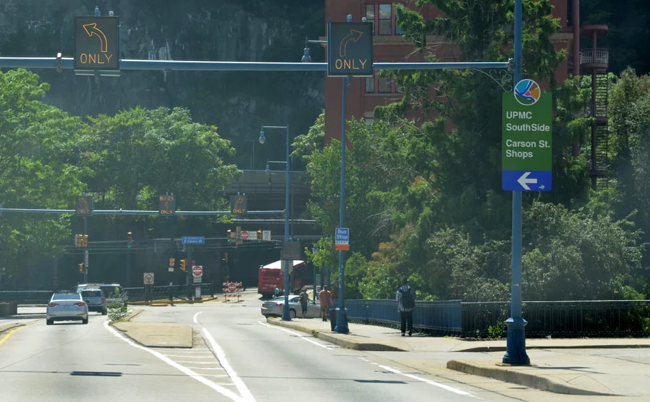
Voila, there you have it, the very complicated street network of the South Side Slopes reimagined as a grid. You can then map routes between the South Side and the Downtown and Oakland Districts as a higher layer of “aggregate effect” routings, and finally the routes that take you out of the City altogether as still another layer. What you have when you are done is a single map graphic, consistent across all zoom levels, that banishes the “weirdnesses” by exposing the previously unexpected and strange turns you have to follow to get to your destination. And you also have the city’s Wayfinder Sign System that seems to know just when you are about to get weirded out, and sets you on the right path, despite Pittsburgh’s best efforts to the contrary!

Finally, at the closest zoom levels, de-complexified maps can be packed with 3-D detail without sacrificing comprehensibility — a boon for small-screen apps and pedestrian sidewalk maps (See the “Reality vs Reality Figured Out” case study.)